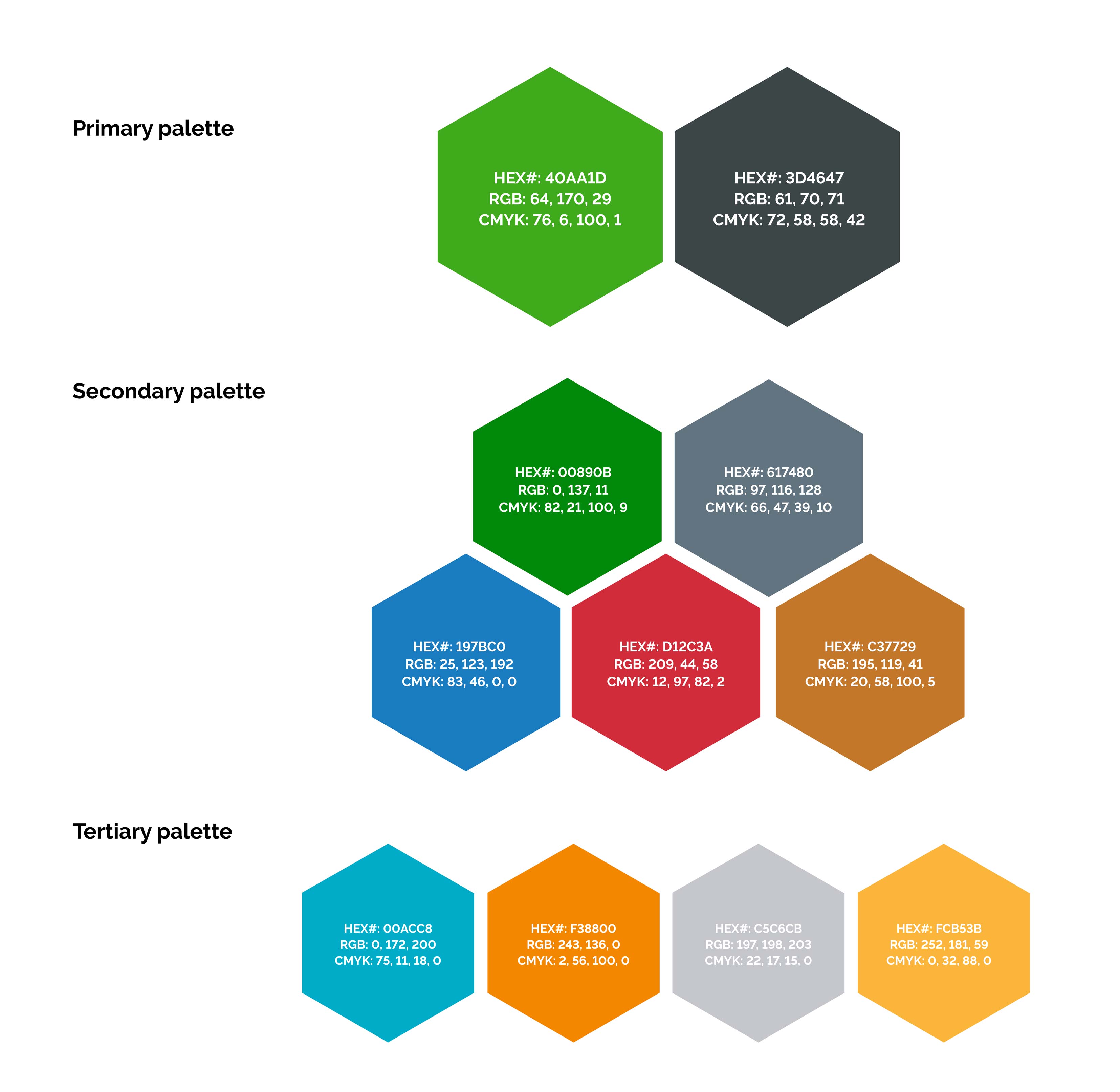
Color Palette
The PTC brand palette consists of two primary colors, five secondary colors, and four tertiary colors. The green and grey are the PTC brand identity.
The secondary grouping are accessible colors that are core to product design and can supplement the two PTC brand colors in marketing. On an asset, refrain from using secondary colors as if they are the primary color. They should feel secondary to the primary green and grey of PTC’s identity.
The tertiary palette colors are not accessible, meaning people with visual impairment are not able to reliably gather information from these colors. Therefore, the use of these colors should be restricted to accents and decorative functions that are not trying to impart information to the viewer.
Print
To ensure consistency of the color palettes, adhere to color specifications for PMS or CMYK for all print communications.
On-screen
For all digital displays (e.g. PowerPoint or websites), refer to RGB or Hex values.
For more detailed usage guidance on accessibility and product implementation of color, please visit the Design System Color page.
Download Palette